Have you been thinking about trying a new look for your Instagram grid, but don’t know where to start? Well, you’ve found the right place. With so many possible Instagram themes to choose from, the best way to figure out what style fits your brand is to get some inspiration through a variety of Instagram feeds that are rockin’ the IG game.
We’ve collected Instagram’s top 10 popular theme ideas and how to create them. Take a look below!
1. Color – Focused Instagram Theme
@thedrybar focuses on creating an aesthetically pleasing feed that incorporates their signature brand color yellow. Whether it’s showcasing product shots or behind the scenes posts, they make sure to follow their moto by “focusing on one thing and being the best at it.”
How to get the look
Whether it’s in your logo or product packaging, find a primary color that represents your brand. This style requires serious discipline! Once you decide on your color, make sure that each and every post somehow incorporates it. Whether it’s a small accent piece or the entire background, this color will be the one common element.
2. Vintage, Warm & Cozy Theme
LA blogger, Courtney, loves all things vintage clothing and thrifting, which she perfectly portrays in her @prettylittlefawn aesthetic. Her advice – a variety of photos is key, while still maintaining a consistent color palette centered around warm earthy tones.
How to get the look
A wide array of photos keep your feed interesting and your followers wanting more. Courtney first edits in Afterlight, as their basic editing is more precise, then finishes in VSCO to create the same look in all her photos. They key here is finding a filter that matches this look such as M5 in VSCO.
Maintaining a consistent brand identity and aesthetic throughout your online presence is one of the most important tenants in e-commerce based businesses. One of the easiest ways to establish a consistent brand identity is through strong visuals, and with Instasize this couldn’t be easier. Instasize provides brands and creatives with an intuitive app interface that facilitates quick and professional photo/video editing and original content creation.
3. Bright, Beachy & Relaxed Theme
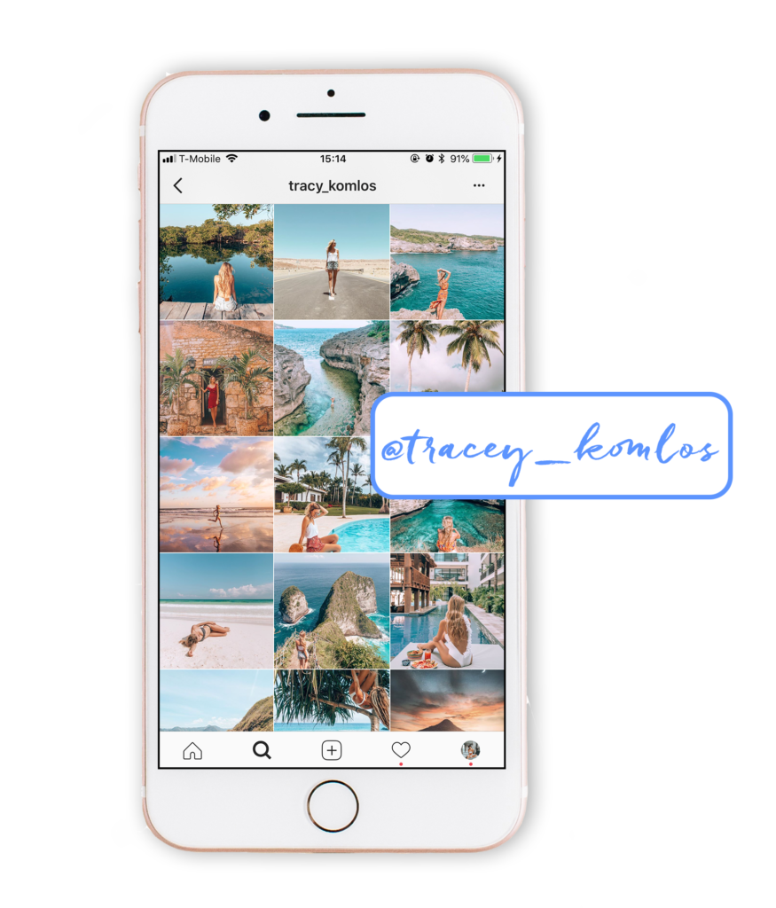
It’s no doubt that a 27 year-old girl from Montreal mesmerizes us with her wanderlust. Tracy Komlos took the idea of passion and combined it with purpose as she began her journey as an entrepreneur, offering brands content creation in beautiful destinations.
How to get the look
With over 90K followers, we love @tracy_komlos images of lonely bays, crystal-clear waters and overlooking cliffs. Tracy brings up the exposure and enhances the saturation, making her photos come to life. Join her on one of her retreats called Pangea Dreams to awaken your ambitions and feel empowered to live the life of your dreams!
4. Bold & Vibrant Theme
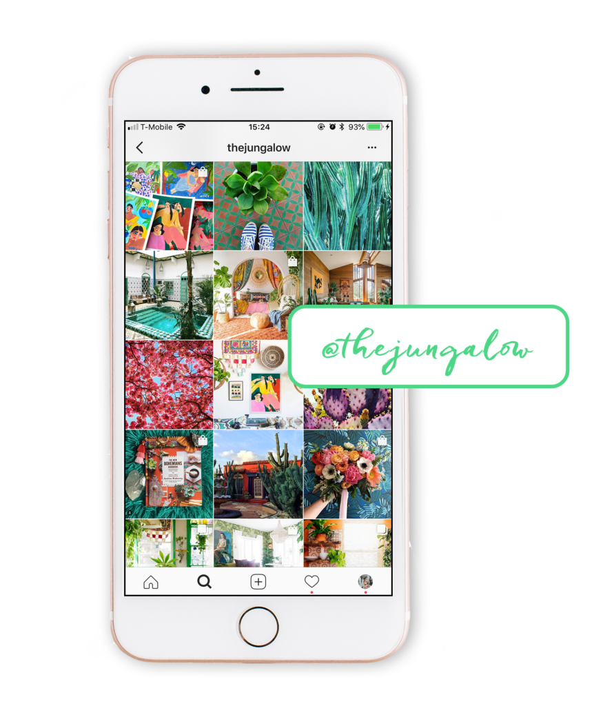
Justine Blakely, designer at @thejungalow, focuses on getting to know her audience and how to reach them. She advises those to “think about your series as stories. People like stories, and enjoy following along a thread and seeing how the stories progress.”
How to get the look
Justine believes that creativity is the key to having an amazing home. @thejungalow perfectly captures this ideology as it celebrates the beauty of color, pattern and plants! The natural colors paired with vibrant textiles and bold accents help make the page pop.
5. Light & Airy Theme
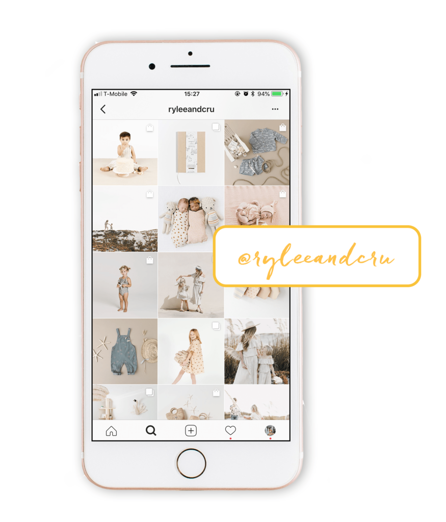
The simplicity of @ryleeandcru aesthetic portrays the pure relationship between a mother and her child. The light color scheme and low contrasts truly complement the unique and artistic clothing made for the modern child.
How to get the look
Natural lighting and a white background provide a bright and airy feel to a photo before you’ve even edited. Composition is also key! Although there is no “perfect formula” on how to create this look, aim for your photo to have 75% white space in the background. That means experimenting with different angles and backdrops.
6. Funky, Retro & Nostalgic
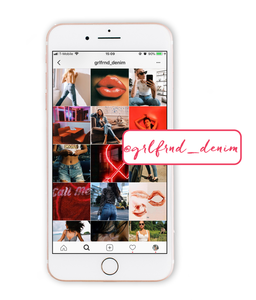
@grlfrnd_denim was invented by denim scientists who pair modern tailoring with a vintage-inspired twist. Inspired by ‘90’s supermodels, Grlfrnd Denim keeps their brand relevant amongst pop culture with their retro red aesthetic.
How to get the look
Use a combination of stock photos of current high fashion models and vintage throwbacks. You can use the apps like HUJI Cam, Photomosh, Camcorder and Glitchr to replicate this restored yet classic look. You’ll feel like you’ve just picked up a stack of photos developed at the drugstore!
7. Rustic & Rural Theme
@upknorth is a lifestyle brand that is dedicated to designing products that are durable, yet functionable and revolve around the rugged outdoor style. The simplicity of the cleanliness of nature is reflected in their design, natural materials, and photos on Instagram.
How to get the look
Want a look that’ll tickle your wanderlust? Tone down the contrast, lower the saturation, and make sure each photo is taken in natural light. Make your followers get their fix of outdoor adventure, even on days they’re stuck inside. You’ll truly make them feel like they’re off the grid.
8. Color- Blocking Theme
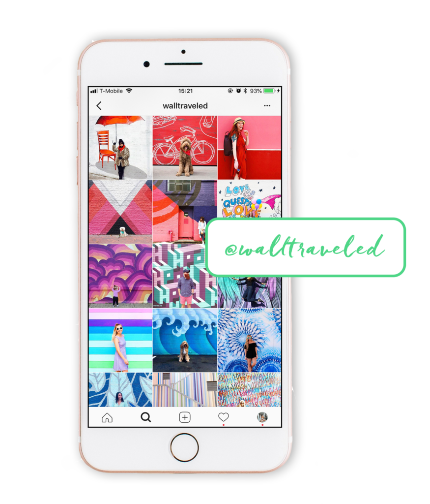
With its series of colorful photos and vibrant hues @walltraveled encourage their followers to document local artists in various cities. They keep their followers wanting to scroll as they continuously transition from color to color.
How to get the look
Collecting user generated content is key here. Provide a branded hashtag such as #walltraveled in your bio so followers will tag you in their photos. Using scheduling apps such as Later or Planoly will allow you to preview your grid ahead of time to ensure a smooth shift from one color block to the next.
9. White Minimalistic Theme
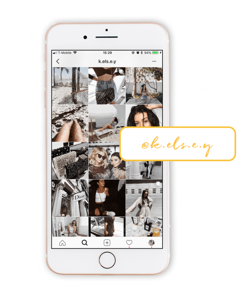
Say hello to the queen of minimalism, @k.els.e.y From her black and white wardrobe to the simplicity of her home decor, there’s no doubt that Kelsey has adopted this style to every aspect of her life.
How to get the look
If you believe in “less is more” this look is the way to go! Big white open space is your best friend here for your photo composition. Desaturate your photos for a cooler feel and try to use neutral colors such as black, white and nude. This will make editing A LOT easier to recreate this look.
10. Borders Theme
Alternating between both horizontal and vertical borders, @Cuyana reinvents the typical clothing catalog by showing their latest products as an artistic collage. Take notes on how this visual platform can work to your advantage.
How to get the look
Challenge Instagram’s square photo grid by changing the aspect ratio of your photos. Despite posting pictures with a variety of colors, your feed will appear elegant, sophisticated and chic. Just be sure that the white frames are always consistent in size!


